What color is Monday? What color is three?
Last year, Twitter personality @Aella collected data from her followers on which colors they associated with specific numbers, days of the week, and months of the year. At first you’d think those answers should be random—of course “Monday” has nothing to do with a particular color. But that’s why this project was interesting: we do associate random things with certain colors, and in many cases we tend to report the same associations. There is a color of Monday.
So, for example, for the question “What color is the number zero?” most people picked white or black. We can guess at the rationale behind this: you might think of something having “zero pigment” (white) or an environment with “zero light” (black).
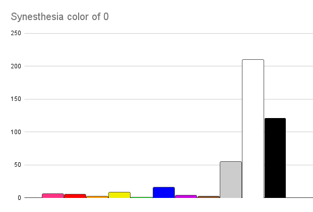
And the rest of the data is presented in a similar way: for each number (1-20), day of the week, and month of the year, it shows each color’s frequency of getting picked.
The reason I’m writing about her project is because I went a bit further in analyzing the data and I wanted to share what I did. I was really curious to see what single color we would get for each figure, if we combined all the poll results. So for example, if you took all the color votes represented here—

—and just mixed the colors, according to their number of votes, what color would you get?
Maybe the artist in me thought it’d be worth knowing how the average person thinks about different colors, to inform how I choose colors in my projects. I don’t really know, but I was too curious to leave it alone.
How to mix colors
The most straightforward way to combine two colors, digitally, is to break them each into their red, green, and blue channels, get the average red, green, and blue values, and then recombine them into a single color.
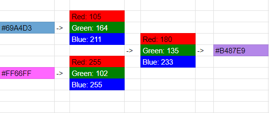
So that’s what I did to the color data from the survey. I converted the verbal responses (“red”, “green”, etc.) to hex codes (#FF0000, #00FF00, etc.), which is a common way to represent colors digitally. A color hex code (like #FF0000) is just three different numbers in hexadecimal format (#FF, #00, and #00), and it tells you the amounts of red, green, and blue that are present in the final color (255, 0, and 0 out of a maximum 255).
Disclaimer: The initial data here is iffy: anyone could take the survey and self-report any color associations they want. And my method of digitizing the colors is iffy: if someone answered “green” I interpreted that as #00FF00 (100% in the green channel, 0% in the other channels). But #00CC00 (50% in the green channel 0% in the others) also appears “green,” so this choice is arbitrary. And, the idea of combining colors is iffy: if half the people answered “red” and half the people answered “blue,” the result will be purple, even though nobody answered “purple.” But, we still do get an answer that is… chromatically closest to the most people.
How to mix colors better
But wait!
I Googled how to mix colors digitally, because I vaguely remembered that there are different ways to do it. That’s when I found this article explaining why you need to average the squares of the RGB values and not just take the direct average. I’ll let the video explain why:
So, by squaring the RBG values, averaging them together, and then taking the square root of that, you get a slightly different result that is brighter (and more accurate) because it accounts for the way our digital screens distort color data.

So I used my spreadsheet to do this color mixing formula—not just between two different colors, but between the tens and hundreds of color responses in the survey data for each field.
Results
Numbers
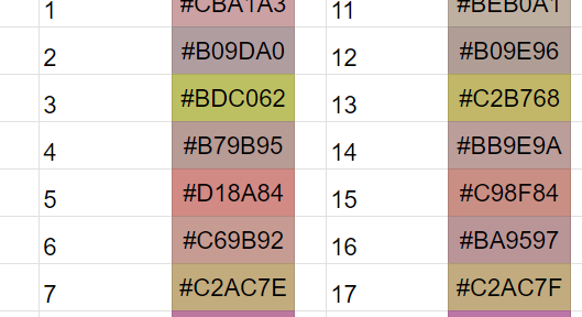
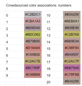
Notably, the numbers one, five, and nine are reddish. Three and seven are greenish. And eight is by far the most unique, with purple. The other numbers don’t have a very clear color result; they show up as brown, which suggests they got roughly even results across many different colors (or, they were voted brown).
One clear trend, which Aella points out in the original report, is that numbers 1-9 respectively match 11-19; 1 has the same color as 11, 2 has the same color as 12, and so on. I guess we only look at the last digit when forming these unconscious associations.
Days of the week
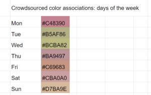
Monday, like the number one, is reddish. Maybe we associate red with dominance and like to picture it as the one coming “first.” Maybe we’re thinking of how red does come first on a natural color spectrum. Tuesday and Wednesday are green, which sort of matches the number three showing up as green. The other days don’t have a very clear color result.
Months of the year
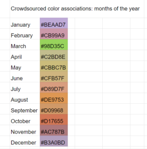
The months of year gave the most vibrant results, which makes sense because different times of the year do naturally correlate with different colors.
January appears purple—maybe a lot of “blue because winter” votes combined with a lot of “red because it comes first” votes. March is bright green, connoting the new growth of spring and also marking a very color-associated holiday, St. Patrick’s Day. The summer month colors connote plants drying out. August, September, and October mark the bright colors of dead leaves. December is purple again, maybe showing a combination of “blue because winter” plus “red because Christmas.”
Data
You can view my spreadsheet here. Make a copy of it if you’d like to play with the data and formulas yourself.

Pat — I was explaining this to my coworkers the other day how I see numbers/days as colors. They thought I was nuts but I’ve had the associations ever since I was a child.
1 = white
2 = brown
3 = yellow
4 = green
5 = orange
6 = magenta
7 = purple
8 = blue
9 = red
10 = black
Monday = Red
Tuesday = Light blue
Wednesday = Red/Yellow
Thursday = Navy
Friday = Orange/Brown
Triangles = yellow
Circles = blue
Squares = green
Trapezoids = orange
Octogons = purple
Wow, sounds like you have legit color synesthesia. I think most people can pick answers if asked, but you’ve actually thought about it before. Do you find that it influences your art in any way?
0yf5al
jwkso3