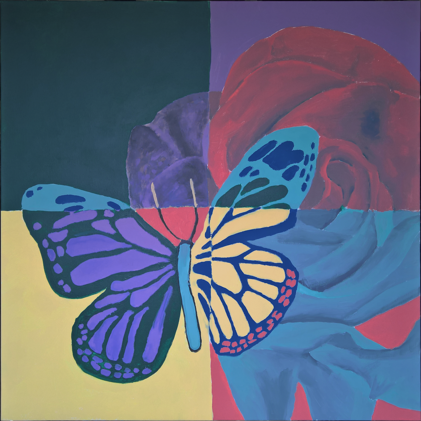
Around mid-2016, my friends and I thought it would be fun to make a painting together. I had this idea of doing basically a color-by-number painting, where the canvas is divided into four sections and each person uses their own choice of colors within their section. We went out and got a canvas and paints, and I found a reference image (a butterfly, because of its easily paintable color zones) and outlined the main shapes in pencil. We divided the canvas into four sections: one for each of us and a fourth to be free-for-all. We had a lot of fun making it; however, due to different people painting at different speeds (and with different levels of self-assurance), I ended up doing most of it.

Butterfly quadrant color painting
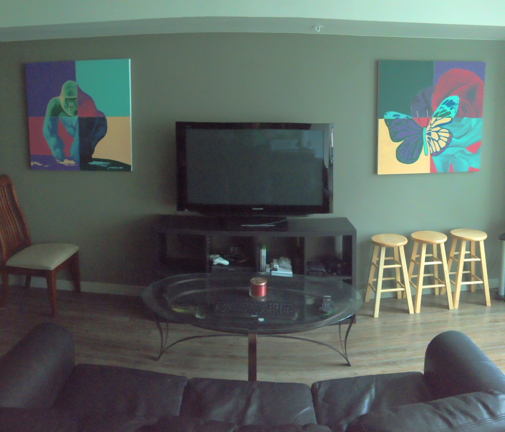
A few months after that, I moved apartments, and my new setup left me with two big spaces on the wall on either side of the TV. I decided to make another painting, in the same colors and style, so I could hang both of them up there.
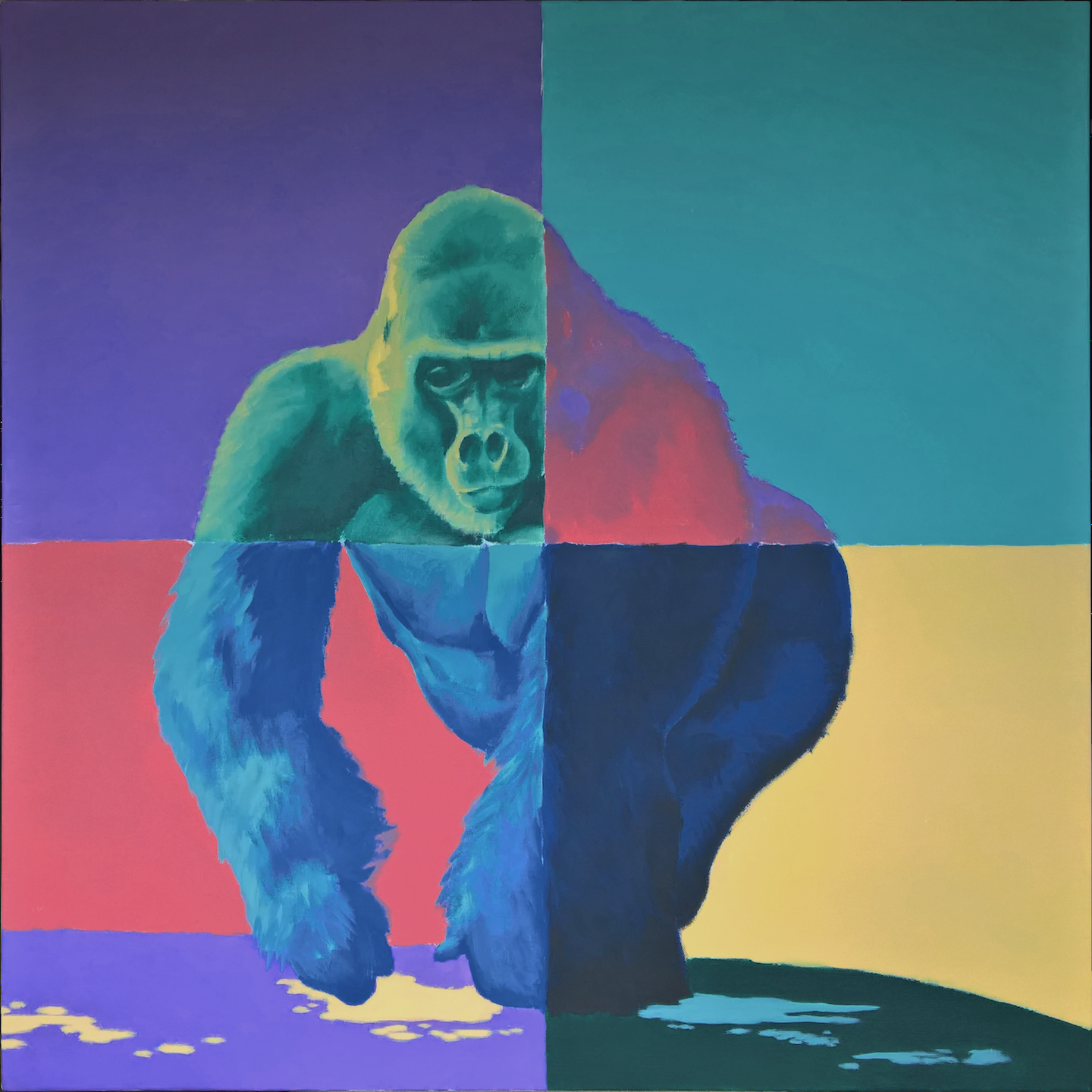
I chose a picture of a gorilla as reference, both because it’s my favorite animal and because I see it as the aesthetic opposite of a butterfly in many ways: big, strong, loud and prominent vs. small, light, silent and fleeting. The painting took me about 12 hours in total.

Gorilla quadrant color painting
As usual with my creative projects, I set up several “rules” to follow in order to make the work match my vision. In the original picture, the only rule was that no two adjacent color zones should be the same color—pretty obvious, because the contrast of colors is the only thing revealing the subject at all. In the second painting, I made some more rules in order to ensure that it matched the style of the first. The butterfly painting had a primary subject (the butterfly), a secondary subject (the flower), and solid background colors. So the gorilla painting would be composed the same: a primary (gorilla) and secondary (pool of water) subject, with a solid background. In the butterfly painting, one subject had discrete colors (the butterfly) and the other had shading between two different colors (the flower). So in the gorilla painting, the gorilla would have two-tone shading (very necessary anyway) and the pool of water would only have discrete sections of colors. Finally, I tried to get a similar ratio of colors as the butterfly painting, which proved to be quite the puzzle, as I had to also consider which colors looked good when shaded together, which colors looked good against different background colors, and what restrictions the colors in one quadrant would set for colors in the adjacent quadrants.
I was very happy with how they both came out, and they made my new apartment look nice and stylish.

Quadrant color paintings on wall


Pingback: Harbor Terminal project - Patrick D. FarleyPatrick D. Farley