– In which I take a dream I had and make it as photorealistic as possible –
Like my Harbor Terminal project, this piece is based on a scene that I saw in a dream. It was a penthouse apartment with a large patio—really more like a small flat placed on the top of a skyscraper. I dreamed I woke up there, went out the door near my bed onto the patio, and looked around, appreciating the view of the mountains as the sun came up. I woke up (in real life) with a really vivid idea of the layout of the apartment and furniture, so I sketched it out. A few weeks later I started making it in Blender.
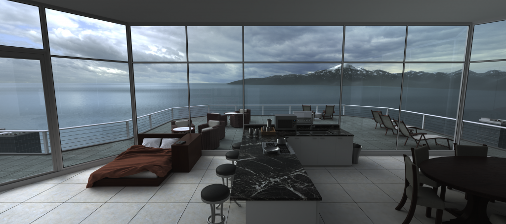
The first thing you’ll notice in the image below is the aspect ratio: it’s very wide. The field of view is 115°, which is about as wide as a human can see with both eyes. So, if you took the entire visual field that appears to wrap around your head, and laid it flat, you’d see something like this image. I did it this way for two reasons: 1) I wanted to show as much of the scene as possible, and 2) in the future I may want to get a print (or painting) of this and hang it above my bed; a wide picture would fit better there.
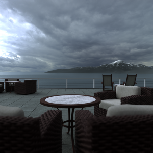
I put a lot of work into this—modeling so many objects, searching the web for the right textures, fine-tuning the lighting effects to achieve photorealism—so I made sure to get a lot out of it. I made six different images with the objects I modeled in this scene. The first three are alternate versions of the original view:
Dream-accurate image
The first image is dream-accurate: it’s as close to the original vision of the dream as I could get. This is what I saw (click for full size):
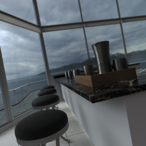
Of course, I still had to make some artistic decisions here. I had a vague feeling that the indoor furniture was stylishly curved, so I custom-designed the dining table and chairs, modeling their legs in basic elliptical arcs. Then I used similar arcs on the bar stools and patio tables. A room that was otherwise dominated by rectangles (especially the grid-like floor and windows) now featured the repeated appearance of these elliptical arcs. I don’t know much about interior design, but I personally like the look of having two basic geometric themes in balance with each other.
Practical interior image
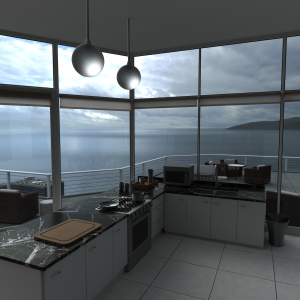
As I was making this I realized that although the space is nice-looking, it isn’t very practical. There’s nothing on the kitchen counter, nothing near the bed, no window blinds, no lights. I added these and a few other touches, trying to make the apartment realistic without changing its major features.
You’ll notice more of this balance of rectangles (wooden tray, bedside shelves) and elliptical curves (metal cups, bedside lamp, lights).
Aesthetic image
Finally, I wanted to make something a little more thoughtful out of all this. This dream had me waking up in my bed and going to look out across the nearby ocean at the mountains. To me the ocean represents chaos—I know that’s what everyone says, but I get it. It’s dangerous and unknown, and we’d feel uncomfortable out in the middle of it. A mountain, too, is dangerous and unknown, but it also carries the hope of an exhilarating challenge. On the other hand, a bed represents safety and comfort—quite the opposite.
It’s interesting that so many of us want to live in homes near the water. I believe we’re happiest at the border of order and chaos—not only in our lifestyles, but even in our physical environment. You go to a party where you don’t know many people; you probably don’t walk right into the middle of the room, and you probably don’t go back to your car; you gravitate to the corner with people you know—the border of the party. You want a cabin in the woods, where untamed nature surrounds you on every side but can’t reach you; you sit and enjoy it from your window or porch—the borders of the house.
We want to keep chaos nearby so that adventurous fantasies can be entertained and adventurous realities can be undertaken once we’re ready. But we also want to keep order nearby, so that when the adventure is over we can return to our domain with a renewed appreciation for its comforts.
I wanted to make these opposing symbols—the bed and the mountain—the focal elements of my scene, so I adjusted the lighting to highlight them. I re-positioned the camera a bit so they’d be lined up in the corners of the thirds. I also arranged the furniture and objects to form guiding lines that direct the eye toward the mountain—I hope that wasn’t too obvious.
My dream started in bed and ended looking out at the mountains. Even in our fantasies, we seek a position at the border of order and chaos; we just make it a more comfortable order, and a more promising chaos.





Patrick, WOW! In addition to being an amazing grandson,
you continue to refresh our minds and souls with your multi
-talented ability and inventiveness in allowing one to visualize
previous unseen multi-dimensions. You are like the magician
of our sight— we see things that we did not see before…an
awesome and awakening experience. We look forward to
you having your dreams come true and our hope is that we
will get to see some of them.
Pingback: Tiered Mansion interior - Patrick D. Farley